Xamarin.Forms 4.0 brings new enhancements to the platform that has Xamarin Developers excited. My favorite new feature is Xamarin Shell which creates simple APIs for building powerful apps that include Tab Bars, Flyout Menus and more! The tooling builds an Application Shell and let’s the developer focus on building their application.
What is Xamarin.Forms Shell?
Xamarin.Forms Shell is a great new way to build apps in Xamarin.Forms. It was released in Xamarin.Forms 4.0 and my friend David Ortinau at Microsoft wrote a great blog on it. Welcome to the Shell Era: Xamarin.Forms 4.0 Released.
Design First
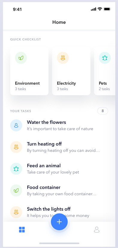
When building mobile apps I always focus on Design First and Development Second. This means the team builds a comprehensive prototype using any of the popular mockup tools. This allows the designers, stakeholders, developers and anyone else get a hands on look at the app without talking about the implementation details. Instead of designing an app, we are going to use a design already put together from Dribble
Mockups
Take a look at the mockups right on Dribble or see the screenshots below
The TabBar
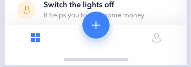
Looking at the Did You design, and notice how custom the TabBar is. There are 2 main Tabs
- Home
- Profile
In the center of the TabBar there is a big plus icon that brings the user to a new task screen.
This is a fantastic design and I am ready to get started, but building the New Task button in the TabBar is going to be complex. As a developer, I really want to use Xamarin Shell.
Let’s start looking at some code!
App Shell
Create the basic App Shell to get started and define all of your navigation items. There are going to be 3 main pages and 3 main tabs
- Dashboard
- Profile
- New Task/ToDo
AppShell.xaml
1
2
3
4
5
6
7
8
9
10
11
12
13
14
15
16
17
18
19
20
21
22
23
<?xml version="1.0" encoding="UTF-8"?>
<Shell xmlns="http://xamarin.com/schemas/2014/forms"
       xmlns:x="http://schemas.microsoft.com/winfx/2009/xaml"
       xmlns:d="http://xamarin.com/schemas/2014/forms/design"
       xmlns:mc="http://schemas.openxmlformats.org/markup-compatibility/2006"
       mc:Ignorable="d"
       xmlns:local="clr-namespace:TodosSample.Views"
       Title="TodosSample"
       x:Class="TodosSample.AppShell">

    <TabBar Style="{StaticResource BaseStyle}">
        <Tab Title="Dashboard" Icon="tab_dashboard.png">
            <ShellContent ContentTemplate="{DataTemplate local:DashboardPage}" />
        </Tab>
        <Tab Title="New Task" Icon="tab_newtask">
            <ShellContent ContentTemplate="{DataTemplate local:NewTaskPage}" />
        </Tab>
        <Tab Title="Profile" Icon="tab_profile.png">
            <ShellContent ContentTemplate="{DataTemplate local:ProfilePage}" />
        </Tab>
    </TabBar>

</Shell>
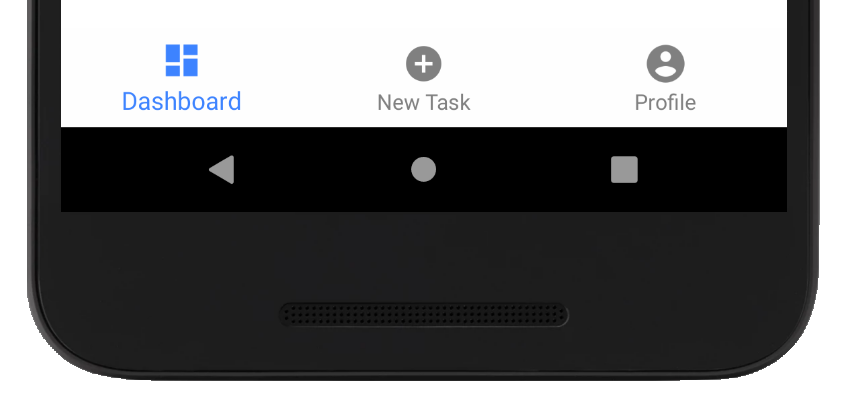
After creating the view we will see the standard Shell Tab Bar that looks something like this.
Resulting View
Not Exactly Right
This isn’t exactly what we want, but it does accomplish the design goals. We now have 3 pages and 3 tabs that configure our navigation with minimal code. The next step is implementing a custom render to really take advantage of the shared APIs.
Shared Code
To simplify our implementation and custom renderer code we need to define a shared control that stores information about the large plus icon (center tab).
Define a Custom TabBar
Let’s call this control TodoTabBar.cs
1
2
3
4
public class TodoTabBar : TabBar
{
    public Tab LargeTab { get; set; }
}
Once created, update the TabBar code in the AppShell.xaml to use the new property.
AppShell.xaml
1
2
3
4
5
6
7
8
9
10
11
12
13
14
15
<c:TodoTabBar Style="{StaticResource BaseStyle}">
    <c:TodoTabBar.LargeTab>
        <Tab Title="New Task" Icon="tab_newtask.png">
            <ShellContent ContentTemplate="{DataTemplate local:NewTaskPage}" />
        </Tab>
    </c:TodoTabBar.LargeTab>

    <Tab Title="Dashboard" Icon="tab_dashboard.png">
        <ShellContent ContentTemplate="{DataTemplate local:DashboardPage}" />
    </Tab>

    <Tab Title="Profile" Icon="tab_profile.png">
        <ShellContent ContentTemplate="{DataTemplate local:ProfilePage}" />
    </Tab>
</c:TodoTabBar>
The new xaml has moved the middle tab out of the main content section of the TabBar and into a new property called LargeTab. The new property will be used in the TodoShellItemRenderer to display the tab as the Large Plus Button from the design.
Platform Android Code
Adding a custom renderer for Shell Renderers is very different that any other custom renderer that you may have built. This is because the ShellRenderer is the main entry point for all things Shell. Once the code is using the ShellRenderer every renderer from that point on is just instantiated. This makes is easy to create custom implementations, but requires an additional step when building any custom Shell functionality.
Steps:
- Create custom
ShellRenderer - Create custom
ShellItemRendereror other specific Shell renderer - Override desired method and instantiate your custom renderer
Let’s get started
Custom ShellRenderer
In the Android Platform project create your custom ShellRenderer in our sample app I called it the TodoShellRenderer. This is the entry point for any custom Shell behaviors you wish to implement.
1
2
3
4
5
6
public class TodoShellRenderer : ShellRenderer
{
    public TodoShellRenderer(Context context) : base(context)
    {
    }
}
don’t forget to Export the Renderer so the Xamarin.Forms Android Platform code knows what renderer to load into memory. If you don’t do this nothing will work!
1
[assembly: ExportRenderer(typeof(Shell), typeof(TodoShellRenderer))]
Our stubbed out TodoShellRenderer
1
2
3
4
5
6
7
8
9
10
[assembly: ExportRenderer(typeof(Shell), typeof(TodoShellRenderer))]
namespace TodosSample.Droid.Renderers
{
    public class TodoShellRenderer : ShellRenderer
    {
        public TodoShellRenderer(Context context) : base(context)
        {
        }
    }
}
Now that we have the main entry point configured, we can start building our Renderer that controls the TabBar. When we finish the ShellItemRenderer we will come back to this class and generate the necessary override to use our new Renderer
Custom ShellItemRenderer
The ShellItemRenderer controls your TabBar, let’s create a TodoShellItemRenderer
1
2
3
4
5
6
public class TodoShellItemRenderer : ShellItemRenderer
{
    public TodoShellItemRenderer(IShellContext shellContext) : base(shellContext)
    {
    }
}
There is no need to add the ExportRenderer statement as this class is instantiated by the TodoShellRender.
Back to the TodoShellRenderer
Now head back to the first class we created TodoShellRenderer and add the following override CreateShellItemRenderer
1
2
3
4
protected override IShellItemRenderer CreateShellItemRenderer(ShellItem shellItem)
{
    return new TodoShellItemRenderer(this);
}
The full TodoShellRenderer
1
2
3
4
5
6
7
8
9
10
11
12
13
14
15
[assembly: ExportRenderer(typeof(Shell), typeof(TodoShellRenderer))]
namespace TodosSample.Droid.Renderers
{
    public class TodoShellRenderer : ShellRenderer
    {
        public TodoShellRenderer(Context context) : base(context)
        {
        }

        protected override IShellItemRenderer CreateShellItemRenderer(ShellItem shellItem)
        {
            return new TodoShellItemRenderer(this);
        }
    }
}
The ShellItem Layout
The default Xamarin Android layout for Shell’s TabBar (ShellItem) defines the following axml
BottomTabLayout.axml
1
2
3
4
5
6
7
8
9
10
11
12
13
14
15
16
17
<?xml version="1.0" encoding="utf-8"?>
<LinearLayout xmlns:android="http://schemas.android.com/apk/res/android"
    android:orientation="vertical"
    android:layout_width="match_parent"
    android:layout_height="match_parent">
  <FrameLayout
    android:id="@+id/bottomtab.navarea"
    android:layout_width="match_parent"
    android:layout_height="0dp"
    android:layout_gravity="fill"
    android:layout_weight="1" />
  <android.support.design.widget.BottomNavigationView
    android:id="@+id/bottomtab.tabbar"
    android:theme="@style/Widget.Design.BottomNavigationView"
    android:layout_width="match_parent"
    android:layout_height="wrap_content"/>
</LinearLayout>
This design doesn’t really allow us to add any views that we can just move where we want on the screen. Trust me I spent the better part of a day trying. Since the layout uses a LinearLayout as the parent container we are limited to what is possible with it.
Fortunately there are other controls that we can use that allow us to overlay a View and manipulate however we need to.
FrameLayoutRelativeLayout- And More!
But how do I replace the Xamarin Android Platform layout code with mine?
Consider the following code snippet which is from the Xamarin Android Platform’s implementation of ShellItemRenderer
1
2
3
4
5
6
7
8
9
10
public override AView OnCreateView(LayoutInflater inflater, ViewGroup container, Bundle savedInstanceState)
{
    base.OnCreateView(inflater, container, savedInstanceState);

    _outerLayout = inflater.Inflate(Resource.Layout.BottomTabLayout, null);
    _bottomView = _outerLayout.FindViewById<BottomNavigationView>(Resource.Id.bottomtab_tabbar);
    _navigationArea = _outerLayout.FindViewById<FrameLayout>(Resource.Id.bottomtab_navarea);

    // ... omitted code ..
}
Notice that the different views are resolved by looking up their unique Ids. If we add the EXACT same layout axml file into our Android Project, it will override the default one letting us customize it to exactly how we want it to look.
Adding our own custom layout axml file overrides the default Xamarin Android Platform provided layout axml.
Using this concept the above code no longer attempts to use the Xamarin Android Platform layout axml but it uses the new one you created. All of the code still works, but it now adds views based on the newly configured layout. This let’s us customize it however we need for the project.
Customize the BottomTabLayout.axml
In your Android Platform Project add a new Android Layout in the Resources->Layouts folder.
For this to work the IDs in the layout must match exactly what was in the Xamarin Androidn Platform layout. I decided to keep my file the name for this sample -BottomTabLayout.axml
The FrameLayout provides a powerful layout stack where the last item can be manipulated as an overlay. This means we can have a special Android View that we can add our special Add Button to.
If you attempt to convert the LinearLayout to a FrameLayout it will not work. I spent 2-3 hours trying to get it to work, but the way Shell renders the different parts of the page requires the LinearLayout.
To solve the problem create a FrameLayout as the parent container and then an additional FrameLayout at the end of the stack which gives you the ViewGroup to add our button to.
BottomTabLayout.axml
1
2
3
4
5
6
7
8
9
10
11
12
13
14
15
16
17
18
19
20
21
22
23
24
25
26
27
28
29
30
31
32
<?xml version="1.0" encoding="utf-8"?>
<FrameLayout xmlns:android="http://schemas.android.com/apk/res/android"
  android:layout_width="match_parent"
  android:layout_height="match_parent">

    <LinearLayout
      android:orientation="vertical"
      android:layout_width="match_parent"
      android:layout_height="match_parent">

      <FrameLayout
        android:id="@+id/bottomtab.navarea"
        android:layout_width="match_parent"
        android:layout_height="0dp"
        android:layout_gravity="fill"
        android:layout_weight="1" />

      <android.support.design.widget.BottomNavigationView
        android:id="@+id/bottomtab.tabbar"
        android:theme="@style/Widget.Design.BottomNavigationView"
        android:layout_width="match_parent"
        android:layout_height="wrap_content"/>

    </LinearLayout>

    <FrameLayout
      android:id="@+id/bottomtab.tabbar.container"
      android:layout_width="wrap_content"
      android:layout_height="wrap_content"
      android:layout_gravity="center_horizontal|bottom" />

</FrameLayout>
The first child is the original LinearLayout container which has the EXACT same view structure. We just encapsulated it into the new parent FrameLayout container, which will allow us to better customize the view.
Now we can implement our TodoShellItemRenderer
Implement the TodoShellItemRenderer
With the new layout configured, a new control and the AppShell.xaml updated we can start implementing our custom renderer to build our large Add Button. Open up the TodoShellItemRenderer that we created earlier.
Start off by creating the private variables that will reference the active views needed by the Renderer
1
2
FrameLayout _shellOverlay;
BottomNavigationView _bottomView;
Next override the OnCreateView method to store the reference of the views and initialize the Large Tab
1
2
3
4
5
6
7
8
9
10
11
public override View OnCreateView(LayoutInflater inflater, ViewGroup container, Bundle savedInstanceState)
{
    var outerlayout = base.OnCreateView(inflater, container, savedInstanceState);
    _bottomView = outerlayout.FindViewById<BottomNavigationView>(Resource.Id.bottomtab_tabbar);
    _shellOverlay = outerlayout.FindViewById<FrameLayout>(Resource.Id.bottomtab_tabbar_container);

    if (ShellItem is TodoTabBar todoTabBar && todoTabBar.LargeTab != null)
        SetupLargeTab();

    return outerlayout;
}
The SetupLargeTab() is guarded by the if statement just in case our code doesn’t instantiate the LargeTab. This is a Renderer you could take to any project.
Finally we get to create the view to contain our tab and add it to the screen. Create the method SetupLargeTab()
Get the TodoTabBar and create the new layout
1
2
var todoTabBar = (TodoTabBar)ShellItem;
var layout = new FrameLayout(Context);
Create the Image from the Icon and add it to the layout. I had to create a custom Image Handler routine. Take a look at the blog by Alejandro Ruiz Varela on this subject - Xamarin.Forms: Get native image from ImageSource
1
2
3
4
5
6
var imageHandler = todoTabBar.LargeTab.Icon.GetHandler();
Bitmap bitmap = await imageHandler.LoadImageAsync(todoTabBar.LargeTab.Icon, Context);
var image = new ImageView(Context);
image.SetImageBitmap(bitmap);

layout.AddView(image);
Specify the Layout Params. This is where you control where on the screen you want the Large Button to render. In our case here we want it to render horizontally centered towards the bottom of the screen with it half over the tab bar and half over the content area.
1
2
3
4
5
var lp = new FrameLayout.LayoutParams(300, 300);
_bottomView.Measure((int)MeasureSpecMode.Unspecified, (int)MeasureSpecMode.Unspecified);
lp.BottomMargin = _bottomView.MeasuredHeight / 2;

layout.LayoutParameters = lp;
The final step is clearing and adding the layout to the view.
1
2
_shellOverlay.RemoveAllViews();
_shellOverlay.AddView(layout);
Putting it all together: SetupLargeTab()
1
2
3
4
5
6
7
8
9
10
11
12
13
14
15
16
17
18
19
20
21
private async void SetupLargeTab()
{
    var todoTabBar = (TodoTabBar)ShellItem;
    var layout = new FrameLayout(Context);

    var imageHandler = todoTabBar.LargeTab.Icon.GetHandler();
    Bitmap bitmap = await imageHandler.LoadImageAsync(todoTabBar.LargeTab.Icon, Context);
    var image = new ImageView(Context);
    image.SetImageBitmap(bitmap);

    layout.AddView(image);

    var lp = new FrameLayout.LayoutParams(300, 300);
    _bottomView.Measure((int)MeasureSpecMode.Unspecified, (int)MeasureSpecMode.Unspecified);
    lp.BottomMargin = _bottomView.MeasuredHeight / 2;

    layout.LayoutParameters = lp;

    _shellOverlay.RemoveAllViews();
    _shellOverlay.AddView(layout);
}
The final TodoShellItemRenderer
1
2
3
4
5
6
7
8
9
10
11
12
13
14
15
16
17
18
19
20
21
22
23
24
25
26
27
28
29
30
31
32
33
34
35
36
37
38
39
40
41
42
43
public class TodoShellItemRenderer : ShellItemRenderer
{
    FrameLayout _shellOverlay;
    BottomNavigationView _bottomView;

    public TodoShellItemRenderer(IShellContext shellContext) : base(shellContext)
    {
    }

    public override View OnCreateView(LayoutInflater inflater, ViewGroup container, Bundle savedInstanceState)
    {
        var outerlayout = base.OnCreateView(inflater, container, savedInstanceState);
        _bottomView = outerlayout.FindViewById<BottomNavigationView>(Resource.Id.bottomtab_tabbar);
        _shellOverlay = outerlayout.FindViewById<FrameLayout>(Resource.Id.bottomtab_tabbar_container);

        if (ShellItem is TodoTabBar todoTabBar && todoTabBar.LargeTab != null)
            SetupLargeTab();

        return outerlayout;
    }

    private async void SetupLargeTab()
    {
        var todoTabBar = (TodoTabBar)ShellItem;
        var layout = new FrameLayout(Context);

        var imageHandler = todoTabBar.LargeTab.Icon.GetHandler();
        Bitmap bitmap = await imageHandler.LoadImageAsync(todoTabBar.LargeTab.Icon, Context);
        var image = new ImageView(Context);
        image.SetImageBitmap(bitmap);

        layout.AddView(image);

        var lp = new FrameLayout.LayoutParams(300, 300);
        _bottomView.Measure((int)MeasureSpecMode.Unspecified, (int)MeasureSpecMode.Unspecified);
        lp.BottomMargin = _bottomView.MeasuredHeight / 2;

        layout.LayoutParameters = lp;

        _shellOverlay.RemoveAllViews();
        _shellOverlay.AddView(layout);
    }
}
Final Product
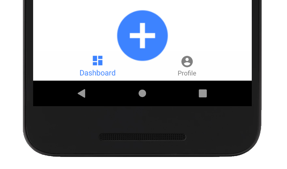
If you followed everything here you can run the app and see our Large Button is now appearing over the Tab Bar!
Success!
No Actions?
This is an advanced Xamarin Technique and our focus is just on the UI for this blog. I did not show how you would hook up the page or an event to the Add Button.
Conclusion
You can now take any of the powerful features of Xamarin.Forms Shell and add your customizations to it. You just need to be familiar with how the ShellRenderer works and where to add new extension points in.
While this is a very advanced topic, if you are interested in an even more complex scenario, I submitted a Pull Request to the platform that implements the Flyout Footer. The code you see in my Pull Request is being used on my current Xamarin.Forms project using this exact same technique!
If you have something that is different than what I documented here, my best advice is to have 2 instances of Visual Studio open. This way you can develop your project and reference the Xamarin.Forms code base at the same time. When I am using this technique having the Xamarin.Forms code available makes it easy to find out what Andorid Layouts I need to create and where my real extension points are.
Sample Code
I have the entire code we built from this article available on GitHub
-Happy Coding


