Xamarin.Forms 3.2.0 released a new feature that is sure to be a favorite among many developers. The TitleView allows developers to quickly customize the Navigation Bar like they never had to before. You can easily add custom images, controls, content, etc. Before the TitleView it was a very long process of creating a custom renderer and platform specific implementations.
The Basic Title
Let’s get started with the most basic title you can add to a Xamarin.Forms app. Go ahead and create a blakn Xamarin.Forms app and follow along as we build out a custom Navigation Bar. When you create your app you will have some C# code in your App.xaml.cs that looks something like this:
1
2
3
4
5
6
7
8
9
10
11
12
13
14
15
16
17
18
19
20
21
22
23
24
25
26
27
28
29
30
31
using Xamarin.Forms;
using Xamarin.Forms.Xaml;

[assembly: XamlCompilation(XamlCompilationOptions.Compile)]
namespace TitleViewSample
{
    public partial class App : Application
    {
        public App()
        {
            InitializeComponent();

            MainPage = new MainPage();
        }

        protected override void OnStart()
        {
            // Handle when your app starts
        }

        protected override void OnSleep()
        {
            // Handle when your app sleeps
        }

        protected override void OnResume()
        {
            // Handle when your app resumes
        }
    }
}
This code sample will not generate any time of Navigation Bar or App Title so it doesn’t really help us.
Simply update the MainPage invocation to
1
MainPage = new NavigationPage(new MainPage());
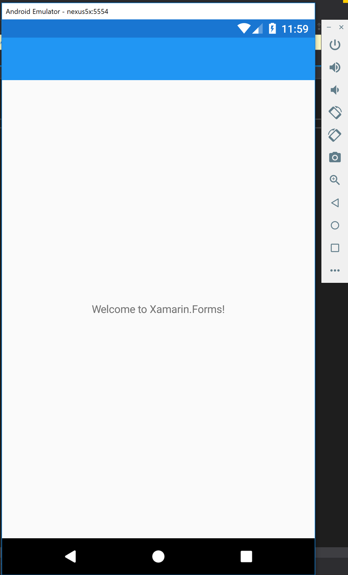
Go ahead and launch your app and you should have the platform default Navigation Bar loaded into the app and it will be empty.
Add a Title
Since an empty Navigation Bar doesn’t really help us or tell the user what is going on with this page we are going to add a title next. Open up the MainPage.xaml file and we will have the default xaml that will look like this:
1
2
3
4
5
6
7
8
9
10
11
12
13
14
<?xml version="1.0" encoding="utf-8" ?>
<ContentPage xmlns="http://xamarin.com/schemas/2014/forms"
             xmlns:x="http://schemas.microsoft.com/winfx/2009/xaml"
             xmlns:local="clr-namespace:TitleViewSample"
             x:Class="TitleViewSample.MainPage">

    <StackLayout>
        <!-- Place new controls here -->
        <Label Text="Welcome to Xamarin.Forms!"
        HorizontalOptions="Center"
        VerticalOptions="CenterAndExpand" />
    </StackLayout>

</ContentPage>
In the top of the page add a new Attribute to the ContentPage element called Title
Title="Hello World"
The completed XAML:
1
2
3
4
5
6
7
8
9
10
11
12
13
14
15
<?xml version="1.0" encoding="utf-8" ?>
<ContentPage xmlns="http://xamarin.com/schemas/2014/forms"
             xmlns:x="http://schemas.microsoft.com/winfx/2009/xaml"
             xmlns:local="clr-namespace:TitleViewSample"
             x:Class="TitleViewSample.MainPage"
             Title="Hello World">

    <StackLayout>
        <!-- Place new controls here -->
        <Label Text="Welcome to Xamarin.Forms!"
        HorizontalOptions="Center"
        VerticalOptions="CenterAndExpand" />
    </StackLayout>

</ContentPage>
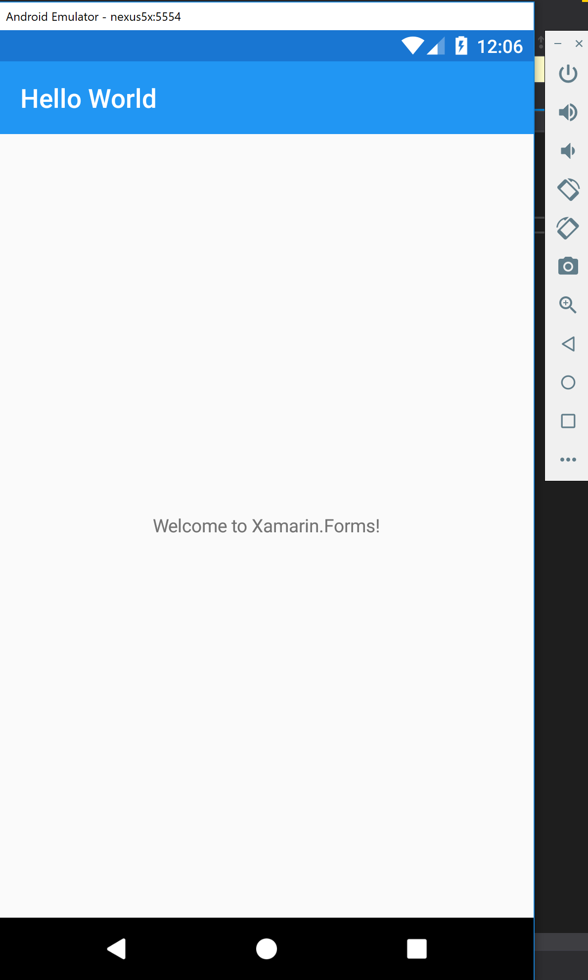
Now we can go ahead and start up our app and you will see “Hello World” as the title
The Problem
Working with the basic controls in the Navigation Bar has been cumbersome due to the need to make complicated Custom Renderers for each platform. If you have ever worked with Custom Renderers they are not the same on each platform because the native APIs are different.
The basic features available here in the standard Navigation Bar work great, and don’t always need to be customized. Unless you want to add:
- Custom Buttons
- Company Logos
- Multi-Line Navigation Titles
- The list goes on
The TitleView Solution
In Xamarin.Forms 3.2.0 a new control was released to the NavigationPage which is called the TitleView. This control allows you to add anything you want to the Navigation Bar at the top of your app with very little code. A task that might have taken days to properly accomplish can now be done in 30 minutes or less depending on what you are trying to build.
Let’s pick up where we left off in our App if you are following along. Open up your MainPage.xaml and add the following code:
1
2
3
<NavigationPage.TitleView>
    <Label Text="Hello World" />
</NavigationPage.TitleView>
The entire file should look like this:
1
2
3
4
5
6
7
8
9
10
11
12
13
14
15
16
17
18
19
20
<?xml version="1.0" encoding="utf-8" ?>
<ContentPage xmlns="http://xamarin.com/schemas/2014/forms"
             xmlns:x="http://schemas.microsoft.com/winfx/2009/xaml"
             xmlns:local="clr-namespace:TitleViewSample"
             x:Class="TitleViewSample.MainPage">

    <NavigationPage.TitleView>
        <Label Text="Hello World" />
    </NavigationPage.TitleView>

    <ContentPage.Content>
        <StackLayout>
            <!-- Place new controls here -->
            <Label Text="Welcome to Xamarin.Forms!"
            HorizontalOptions="Center"
            VerticalOptions="CenterAndExpand" />
        </StackLayout>
    </ContentPage.Content>

</ContentPage>
If you run your app now, it will look exactly as it did before, which is what we want. The difference is we are now using the NavigationPage.TitleView which can take a View inside of the Element. This means we can start adding whatever we want, just as if we were editing XAML inside of the ContentPage.Content
The next sections are broken into different solutions you can try with the TitleView
Multi-Line Title
A commonly requested feature in Enterprise Apps is to print out a department name in the Navigation Bar that identifies the group the App was built for or the department the page on the App is for. These names can be very verbose and often take up more than the space allotted on the tiny screens of smart phones.
Update the TitleView we created earlier to have a really long title int he Label control.
1
2
3
4
5
6
7
8
9
10
11
<?xml version="1.0" encoding="utf-8" ?>
<ContentPage xmlns="http://xamarin.com/schemas/2014/forms"
             xmlns:x="http://schemas.microsoft.com/winfx/2009/xaml"
             xmlns:local="clr-namespace:TitleViewSample"
             x:Class="TitleViewSample.MainPage">

    <NavigationPage.TitleView>
        <Label Text=" World, this is how we say hello from Xamarin. This is the second line of our content" />
    </NavigationPage.TitleView>

</ContentPage>
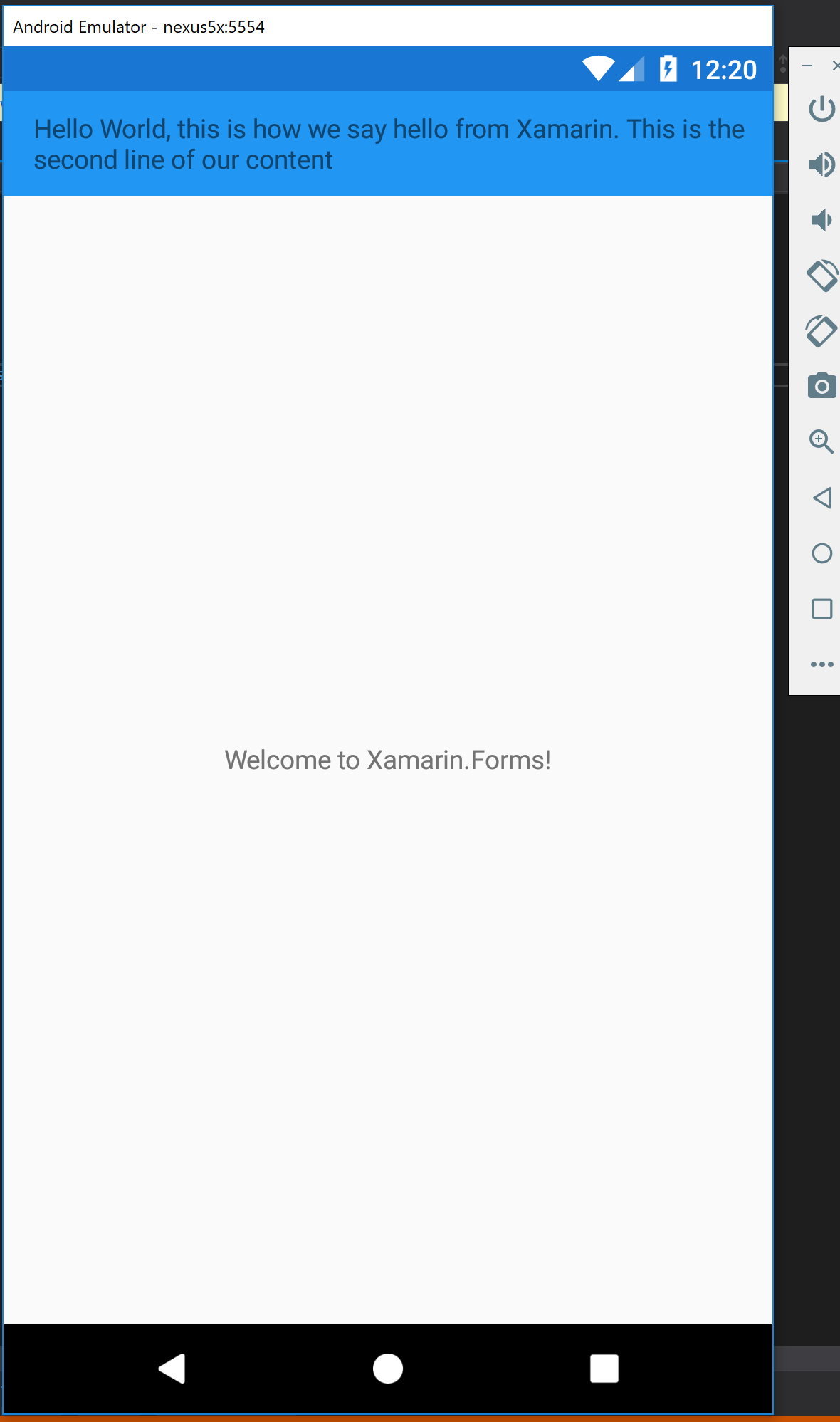
When you launch the app, it will automatically wrap the text as we would expect it to do with the Label control. Since we are no longer using the default Title text property and we are now writing out XAML as a Content section it just works.
Your output should look like this at this point:
Company Logo
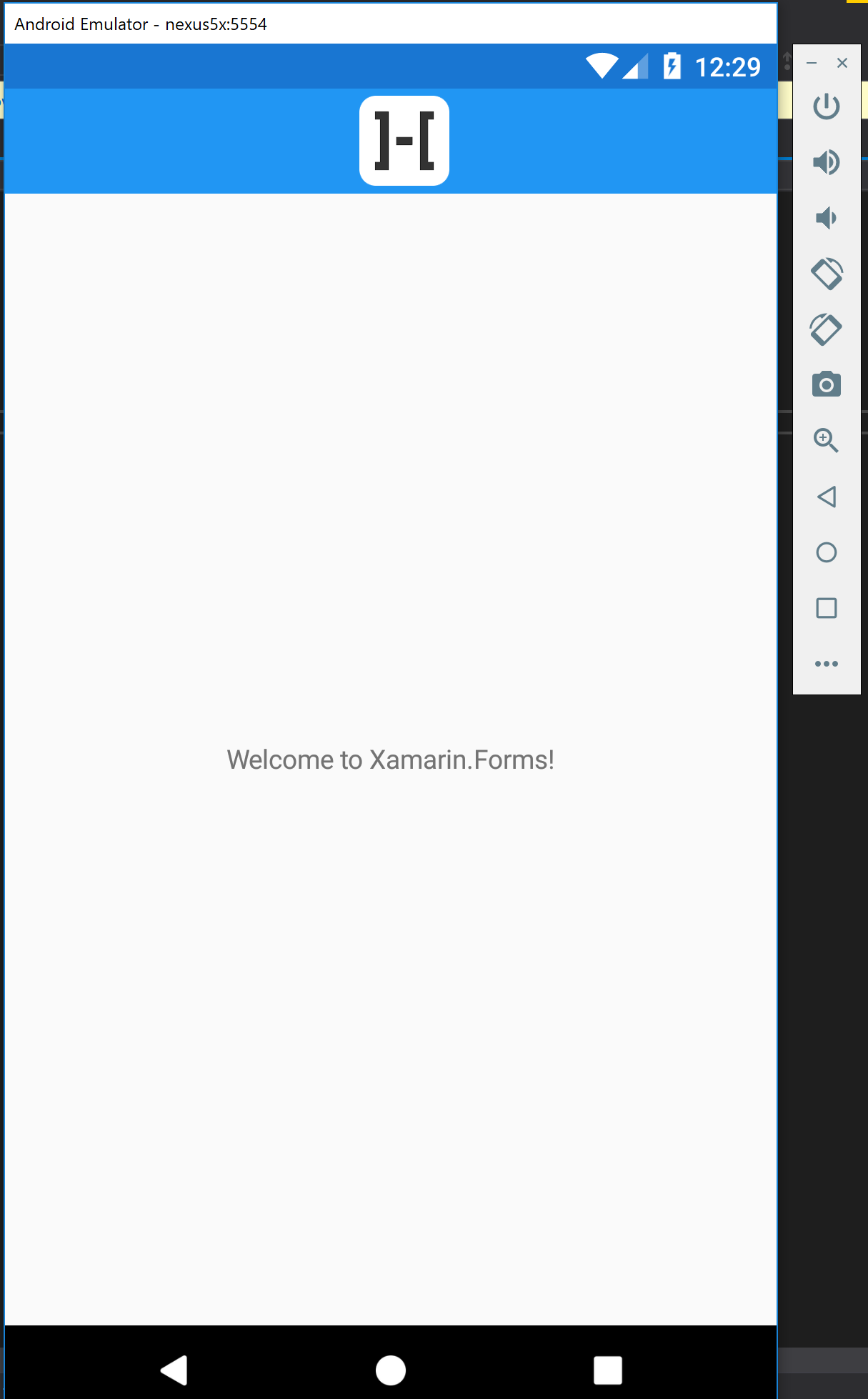
A common request is having the company logo centered in the Navigation Bar. No one wants to read text for their company branding, they want to see their logo that they have spent time and money making perfect.
Since the TitleView is just like any other Content section of XAML we can add our image right into it. Here is a sample of how you would create a Company Logo centered:
1
2
3
4
5
6
7
8
9
10
11
12
13
<?xml version="1.0" encoding="utf-8" ?>
<ContentPage xmlns="http://xamarin.com/schemas/2014/forms"
             xmlns:x="http://schemas.microsoft.com/winfx/2009/xaml"
             xmlns:local="clr-namespace:TitleViewSample"
             x:Class="TitleViewSample.MainPage">

    <NavigationPage.TitleView>
        <Image Source="company_logo"
               VerticalOptions="CenterAndExpand"
               HorizontalOptions="CenterAndExpand" />
    </NavigationPage.TitleView>

</ContentPage>
When you run the app it will now render your company logo int he center of the Navigation Bar
Corner Images and a Title
As you work out the design of your app you may want a more complicated Navigation Bar that has a company logo, title and a call to action with a button. While there is a lot more going on with the Navigation Bar the principles are still the same.
Just add XAML for what you want and wire it up.
But WAIT! This one requires a few more steps since. All of our TitleView XAML up until this point was 1 control. Since we are going to be adding many controls you will need to add a container element such as a StackLayout or a Grid
1
2
3
4
5
6
7
8
9
10
11
12
13
<?xml version="1.0" encoding="utf-8" ?>
<ContentPage xmlns="http://xamarin.com/schemas/2014/forms"
             xmlns:x="http://schemas.microsoft.com/winfx/2009/xaml"
             xmlns:local="clr-namespace:TitleViewSample"
             x:Class="TitleViewSample.MainPage">

    <NavigationPage.TitleView>
        <StackLayout Orientation="Horizontal">

        </StackLayout>
    </NavigationPage.TitleView>

</ContentPage>
It is important to make sure you make your grid Orientation="Horizontal" otherwise you will run out of room very quickly.
At this point we are going to add our controls
1
2
3
4
5
6
7
8
9
10
11
12
13
14
15
<?xml version="1.0" encoding="utf-8" ?>
<ContentPage xmlns="http://xamarin.com/schemas/2014/forms"
             xmlns:x="http://schemas.microsoft.com/winfx/2009/xaml"
             xmlns:local="clr-namespace:TitleViewSample"
             x:Class="TitleViewSample.MainPage">

    <NavigationPage.TitleView>
        <StackLayout Orientation="Horizontal">
            <Image Source="company_logo"  />
            <Label Text="Hoefling Software" />
            <Image Source="company_logo" />
        </StackLayout>
    </NavigationPage.TitleView>

</ContentPage>
We added 3 controls to display an image on each corner of the Navigation Bar and a company title in the middle.
My fully styled solution looks like this:
1
2
3
4
5
6
7
8
9
10
11
12
13
14
15
16
17
18
19
20
21
22
23
<?xml version="1.0" encoding="utf-8" ?>
<ContentPage xmlns="http://xamarin.com/schemas/2014/forms"
             xmlns:x="http://schemas.microsoft.com/winfx/2009/xaml"
             xmlns:local="clr-namespace:TitleViewSample"
             x:Class="TitleViewSample.MainPage">

    <NavigationPage.TitleView>
        <StackLayout Orientation="Horizontal">
            <Image Source="company_logo"
                   VerticalOptions="CenterAndExpand"
                   HorizontalOptions="Start" />
            <Label Text="Hoefling Software"
                   HorizontalOptions="StartAndExpand"
                   VerticalOptions="CenterAndExpand"
                   FontAttributes="Bold"
                   FontSize="20"/>
            <Image Source="company_logo"
                   VerticalOptions="CenterAndExpand"
                   HorizontalOptions="End" />
        </StackLayout>
    </NavigationPage.TitleView>

</ContentPage>
When you build and deploy this code out it should generate a screen with an Image in the corners and a Title starting right after the first image.
Conclusion
With the addition of Xamarin.Forms new TitleView it gives you great flexibility and power to really customize the NavigationBar across the platforms to your business requirments. I have built many custom renderers that took my team days and weeks in some cases, now this is an easy task that shouldn’t take more than a day from start to finish.
Source Code Available:
Happy Coding!


